Difference between revisions of "Chromaticity"
Cmditradmin (talk | contribs) m |
Cmditradmin (talk | contribs) |
||
| Line 53: | Line 53: | ||
The dominant color designation is then obtained by extrapolating the line in the opposite direction to a saturated spectral color it is given as "complementary dominant wavelength 495 nm" or 495c. The color of this apple is therefore the visual equivalent of a mixture of white light and the 495c saturated purple-red in the intensity ratio of the distances p to q shown in the figure with a purity of 100p/(p + q) percent. | The dominant color designation is then obtained by extrapolating the line in the opposite direction to a saturated spectral color it is given as "complementary dominant wavelength 495 nm" or 495c. The color of this apple is therefore the visual equivalent of a mixture of white light and the 495c saturated purple-red in the intensity ratio of the distances p to q shown in the figure with a purity of 100p/(p + q) percent. | ||
=== Incandescent light sources === | |||
<br clear='all'>=== Incandescent light sources === | |||
[[Image:533px-PlanckianLocus.png|thumb|300px|]] | [[Image:533px-PlanckianLocus.png|thumb|300px|]] | ||
| Line 61: | Line 62: | ||
The color of daylight changes over the course of a day. LED designers could make the color of their devices change during the day to better match the daylight experience. Some white lights feel “warmer “ or “colder “depending on the color balance. LEDs will have the same descriptives. | The color of daylight changes over the course of a day. LED designers could make the color of their devices change during the day to better match the daylight experience. Some white lights feel “warmer “ or “colder “depending on the color balance. LEDs will have the same descriptives. | ||
== External Links == | == External Links == | ||
Revision as of 11:57, 26 August 2009
| Previous Topic | Return to Luminescence Menu | Next Topic |
Chromaticity
Engineers and designers have very specific requirements for light emitting and light absorbing materials. They frequently used a system called tristimulus system to precisely specify any possible color, even those that can not be described with a simple wavelength.
Tristimulus measurement and chromaticity diagrams
The tristimulus color measurement system is based on visually matching a color under standardized conditions against the three primary colors, red, green, and blue; the three results are expressed as X, Y, and Z, respectively, and are called tristimulus values
These values specify not only color but also visually perceived reflectance, since they are calculated in such a way that the Y value equals a sample's reflectivity (39.1 percent in this example) when visually compared to a standard white surface by a standard (average) viewer under average daylight.
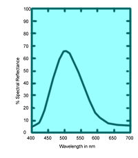
The tristimulus values of the emerald-green pigment of Figure 6 are X = 22.7, Y = 39.1, and Z = 31.0
The tristimulus values can also be used to determine the visually perceived dominant spectral wavelength (which is related to the hue) of a given sample; the dominant wavelength of the emerald-green pigment is 511.9 nm:
it is based on the values x, y, and z,
Where
x = X/(X + Y + Z)
y = Y/(X + Y + Z)
z = Z/(X + Y + Z)
Note that x + y + z = 1; thus if two values are known, the third can always be calculated and the z value is usually omitted thus, the x and y values together constitute the chromaticity of a sample light and dark colors that have the same chromaticity (and are therefore plotted at the same point on the two-dimensional chromaticity diagram) can be distinguished in a third dimension (by their luminance or visually perceived brightness).
White light is x= 1/3, y = 1/3 and z= 1/3. This is achromatic point. Pure grays and black are the same hue as white light but vary only in the magnitude of their luminance. Occasionally colors will be also be described using luminance as well.
So for the goal of LED makers is to make a white light with x and y values close to 1/3.
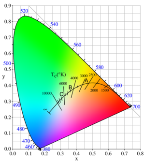
Around the horseshoe shaped periphery are the pure saturated colors , beginning with 400nm (violet) and going around to 700 nm (red). Those are the colors of the visible spectrum. The straight line across the bottom are colors that come from the non-spectral mixing of violet and red, they do not correspond to a single wavelength.
Plotting CIE values
By plotting the calculated x = 0.245 and y = 0.421 of the emerald-green pigment at point E on the chromaticity diagram and extending a line through it from the achromatic point W to the saturated spectral boundary, it is possible to determine the dominant wavelength of the pigment color, 511.9 nm. Emerald green is not a pure color. But it can be made by mixing the pure color with wavelength 511.9nm with white light.
The color of the pigment is the visual equivalent of adding white light and light of 511.9 nm in amounts proportional to the lengths n (the distance between points E and W) and m (the distance between E and the point of the dominant wavelength) in the figure. The saturation or purity equals 100n/(m + n) percent - in this case, 22.8 percent. A purity of 100 percent corresponds to a pure saturated spectral color and 0 percent to the achromatic colors (white, gray, and black)
Another example, a red apple marked R on the diagram. If you connect the line through w and R it intersects the bottom line which are not pure spectral colors. In this case this shade of red must be defined in terms of the complementary color on the opposite side of the achromatic point.
The dominant color designation is then obtained by extrapolating the line in the opposite direction to a saturated spectral color it is given as "complementary dominant wavelength 495 nm" or 495c. The color of this apple is therefore the visual equivalent of a mixture of white light and the 495c saturated purple-red in the intensity ratio of the distances p to q shown in the figure with a purity of 100p/(p + q) percent.
=== Incandescent light sources ===
Light from incandescent sources falls on the solid curve marked with temperatures in this figure, following the sequence saturated red to saturated orange to unsaturated yellow to white to unsaturated bluish white for an infinite temperature.
The points A, B, and C on the curve are CIE standard illuminants that approximate, respectively, a 100-watt incandescent filament lamp at a color temperature of about 2,850 K, noon sunlight (about 4,800 K), and average daylight (about 6,500 K)
The color of daylight changes over the course of a day. LED designers could make the color of their devices change during the day to better match the daylight experience. Some white lights feel “warmer “ or “colder “depending on the color balance. LEDs will have the same descriptives.
External Links
Hyperphysics materials about chromaticity
| Previous Topic | Return to Luminescence Menu | Next Topic |

