Color and Chromaticity
| Previous Topic | Return to Basics of Light Menu |
There are many terms that describe color. In addition to descriptive terms there are corresponding quantitative terms.
Light absorption
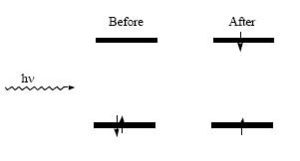
When a molecule interacts with light and energy is absorbed, the molecule is said be excited and a transition occurs which can take the molecule from an initial state to a higher energy state
Within the one-electron approximation, this is described by the promotion of an electron from a filled orbital to an unfilled orbital (in the case of diamagnetic materials). The difference in energy between those levels, (the excited state and the ground state), gives the energy of the photons that can be absorbed.
Several parameters can be used to characterize this transition, including the energy of the incident radiation required for the efficient absorption of the light and the inherent ability of the molecules to absorb radiation of the appropriate energy by the Planck relation:
- <math>\Delta E_{ge} = E_{excited state}-E_{ground state} = h\nu\,\!</math>
where hv is the energy of the photon corresponding to the energy gap between the states.
The energy is reported in several units; the following is helpful for translating between some common units one comes across in the literature:
1 eV = 23.06 kcal/mol = 8065 cm-1 = 1240 nm
Common Color Description
Our perception of color is determined by what wavelengths of radiation reach our eye and the sensitivity of the receptors in our eye to various colors The eye has rods and cones containing chromophores which convert light into electrical impulse that the brain uses to perceive images. This the opposite of what you see in light emitting diodes in which electricity causes emission of light.
The rods function under low intensity conditions and provide images in shades of black, grey, and white This is referred to as scotopic vision
The cones process images of high intensity in color which is referred to as photopic vision. Cones come in three varieties which correspond roughly to blue, green, and red sensitivities; if all three cones are simultaneously excited, then the image will appear white.
See also Physics Classroom tutorial
Complementary Colors
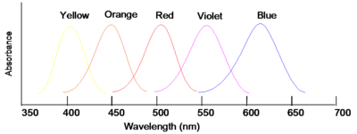
If wavelengths of light from a certain region of the spectrum are absorbed by a material, then the material will appear to be the complementary color. Thus, for instance, if violet light with wavelength of 400nm is absorbed, the material will look yellow. If the material absorbs blue you will see the color orange.
| Color absorbed | Color seen |
|---|---|
| Violet | Yellow |
| Blue | Orange |
| Green | Red |
| Yellow | Violet |
| Orange | Blue |
Note that green is not indicated in the figure; this is because materials that appear green actually absorb in the red and the blue (i.e., about 650 nm and 425 nm) band shape and color
Our ability to perceive very small differences in color is rather extraordinary; for instance, two solutions which appear to have virtually identical absorption spectra, with minute differences in their tails, can be recognized as clearly different hues. Very small changes in the shape of an absorption band (not only the position) will cause materials to appear different shades
Bright and Dull
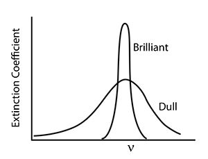
In general, colors that we perceive as brilliant and bright have strong narrow absorption bands whereas dull colors tend to have weaker and broader absorption bands.
Hue and Saturation
The hue is that aspect of color usually associated with terms such as red, orange, yellow, and so forth.Hue distinguishes the color purity of the dominant color (i.e. red from yellow). The position of absorption maxima largely determines this property.
saturation (also known as chroma, or tone) refers to relative purity; when a pure, vivid, strong shade of red is mixed with a variable amount of white, weaker or paler reds are produced, each having the same hue but a different saturation; such paler colors are called unsaturated colors. You can define the amount of saturation of a given using a chromaticity diagram. For example, suppose you had a red color and you slowly increased the amount of blue and green light reaching the eye, then the mixture of the red, blue and green would contribute to the perception of white. White plus red would give pink. The hue would not have been altered, but the saturation would be lower
Light of any given combination of hue and saturation can have a variable brightness (also called intensity, lightness, or value), which depends on the total amount of light energy present. Lightness of a color is changed by varying the intensity of all three primary colors by the same amount. For example, if the intensity of a red were increased it would appear brown.
RGB Color Mixing Schema
All colors can be create by the addition of the primary colors. Use this Flash application to explore color mixing.
<swf width="600" height="500">http://depts.washington.edu/cmditr/mediawiki/images/f/fc/Colorbox.swf</swf>
https://flash.puffin.com/depts.washington.edu/cmditr/mediawiki/images/f/fc/Colorbox.swf
Engineers and designers have very specific requirements for light emitting and light absorbing materials. They frequently use a color measurement system called tristimulus to precisely specify any possible color, even those that can not be described with a simple wavelength.
Tristimulus measurement and chromaticity diagrams
The tristimulus color measurement system is based on visually matching a color under standardized conditions against the three primary colors, red, green, and blue; the three results are expressed as X, Y, and Z, respectively, and are called tristimulus values
These values specify not only color but also visually perceived reflectance, since they are calculated in such a way that the Y value equals a sample's reflectivity (39.1 percent in this example) when visually compared to a standard white surface by a standard (average) viewer under average daylight.
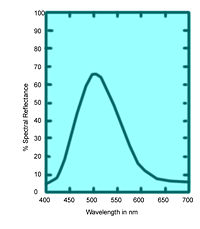
The tristimulus values of the emerald-green pigment of Figure 6 are X = 22.7, Y = 39.1, and Z = 31.0
The tristimulus values can also be used to determine the visually perceived dominant spectral wavelength (which is related to the hue) of a given sample; the dominant wavelength of the emerald-green pigment is 511.9 nm:
it is based on the values x, y, and z,
Where
x = X/(X + Y + Z)
y = Y/(X + Y + Z)
z = Z/(X + Y + Z)
Note that x + y + z = 1; thus if two values are known, the third can always be calculated and the z value is usually omitted thus, the x and y values together constitute the chromaticity of a sample light and dark colors that have the same chromaticity (and are therefore plotted at the same point on the two-dimensional chromaticity diagram) can be distinguished in a third dimension (by their luminance or visually perceived brightness).
White light is x= 1/3, y = 1/3 and z= 1/3. This is achromatic point. Pure grays and black are the same hue as white light but vary only in the magnitude of their luminance. Occasionally colors will be also be described using luminance as well.
So for the goal of LED makers is to make a white light with x and y values close to 1/3.
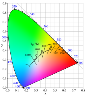
Around the horseshoe shaped periphery are the pure saturated colors , beginning with 400nm (violet) and going around to 700 nm (red). Those are the colors of the visible spectrum. The straight line across the bottom are colors that come from the non-spectral mixing of violet and red, they do not correspond to a single wavelength.
Plotting CIE values
By plotting the calculated x = 0.245 and y = 0.421 of the emerald-green pigment at point E on the chromaticity diagram and extending a line through it from the achromatic point W to the saturated spectral boundary, it is possible to determine the dominant wavelength of the pigment color, 511.9 nm. Emerald green is not a pure color. But it can be made by mixing the pure color with wavelength 511.9nm with white light.
The color of the pigment is the visual equivalent of adding white light and light of 511.9 nm in amounts proportional to the lengths n (the distance between points E and W) and m (the distance between E and the point of the dominant wavelength) in the figure. The saturation or purity equals 100n/(m + n) percent - in this case, 22.8 percent. A purity of 100 percent corresponds to a pure saturated spectral color and 0 percent to the achromatic colors (white, gray, and black)
Another example, a red apple marked R on the diagram. If you connect the line through w and R it intersects the bottom line which are not pure spectral colors. In this case this shade of red must be defined in terms of the complementary color on the opposite side of the achromatic point.
The dominant color designation is then obtained by extrapolating the line in the opposite direction to a saturated spectral color it is given as "complementary dominant wavelength 495 nm" or 495c. The color of this apple is therefore the visual equivalent of a mixture of white light and the 495c saturated purple-red in the intensity ratio of the distances p to q shown in the figure with a purity of 100p/(p + q) percent.
Incandescent light sources
Light from incandescent sources falls on the solid curve marked with temperatures in this figure, following the sequence saturated red to saturated orange to unsaturated yellow to white to unsaturated bluish white for an infinite temperature.
The points A, B, and C on the curve are CIE standard illuminants that approximate, respectively, a 100-watt incandescent filament lamp at a color temperature of about 2,850 K, noon sunlight (about 4,800 K), and average daylight (about 6,500 K)
The color of daylight changes over the course of a day. LED designers could make the color of their devices change during the day to better match the daylight experience. Some white lights feel “warmer “ or “colder “depending on the color balance. LEDs will have the same descriptives.
External Links
Please note that others may also have edited the contents of this article.
|
| Previous Topic | Return to Basics of Light Menu |
