Difference between revisions of "Color and Chromaticity"
Cmditradmin (talk | contribs) |
Cmditradmin (talk | contribs) |
||
| Line 49: | Line 49: | ||
== Bright and Dull == | == Bright and Dull == | ||
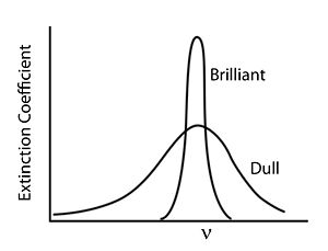
[[Image:Brightanddull.jpg|thumb|300px|]] | [[Image:Brightanddull.jpg|thumb|300px|A sharp absorption peak results in the perception of a saturated color.]] | ||
In general, colors that we perceive as brilliant and bright have strong narrow absorption bands whereas dull colors tend to have weaker and broader absorption bands. | In general, colors that we perceive as brilliant and bright have strong narrow absorption bands whereas dull colors tend to have weaker and broader absorption bands. | ||
== Color Description == | == Color Description == | ||
Revision as of 13:20, 4 May 2009
Return to Luminescence Menu | Next Topic
Color
Our perception of color is determined by what wavelengths of radiation reach our eye and the sensitivity of the receptors in our eye to various colors The eye has rods and cones containing chromophores which convert light into electrical impulse that the brain uses to perceive images. This the opposite of what you see in light emitting diodes in which electricity causes emission of light.
The rods function under low intensity conditions and provide images in shades of black, grey, and white This is referred to as scotopic vision
The cones process images of high intensity in color which is referred to as photopic vision.
Cones come in three varieties which correspond roughly to blue, green, and red sensitivities; if all three cones are simultaneously excited, then the image will appear white.
Complementary Colors
If wavelengths of light from a certain region of the spectrum are absorbed by a material, then the materials will appear to be the complementary color Thus, for instance, if violet light with wavelength of 400nm is absorbed, the material will look yellow. If the material absorbs blue you will see the color orange.
| Color absorbed | Color seen |
|---|---|
| Violet | Yellow |
| Blue | Orange |
| Green | Red |
| Yellow | Violet |
| Orange | Blue |
Note that green is not indicated in the figure; this is because materials that appear green actually absorb in the red and the blue (i.e., about 650 nm and 425 nm) band shape and color
Our ability to perceive very small differences in color is rather extraordinary; for instance, two solutions which appear to have virtually identical absorption spectra, with minute differences in their tails, can be recognized as clearly different hues. Very small changes in the shape of an absorption band (not only the position) will cause materials to appear different shades
Bright and Dull
In general, colors that we perceive as brilliant and bright have strong narrow absorption bands whereas dull colors tend to have weaker and broader absorption bands.
Color Description
The hue is that aspect of color usually associated with terms such as red, orange, yellow, and so forth.
saturation (also known as chroma, or tone) refers to relative purity; when a pure, vivid, strong shade of red is mixed with a variable amount of white, weaker or paler reds are produced, each having the same hue but a different saturation; such paler colors are called unsaturated colors. You can define the amount of saturation of a given using a chromaticity diagram.
Light of any given combination of hue and saturation can have a variable brightness (also called intensity, lightness, or value), which depends on the total amount of light energy present
